Andrés Rozo
Lead Product Designer · Colombia · Remote

I turn complex products into experiences people actually adopt.

12+Years designing digital products
4Industries: finance, healthcare, insurance, e-commerce
3Global consultancies: EPAM, Wizeline, Monstarlab
Design ThinkingInformation ArchitectureExperience MappingUser ResearchFacilitationUser TestingPrototypingAI-assisted design
Featured case · Investment operations

A 15-year-old platform opens up to its own clients.

From legacy screens and spreadsheets to one workflow, for one of the world's largest asset managers.

Open the case 3 measured results inside
BlackRockAladdin AdamX · Lead Designer
More projects

Five more cases where complex became clear.

Case 02 · HealthcareMedecision

UM Vision

Lead Designer · team of 3 · 2022–2024 · via Wizeline

How do you get clinicians out of re-typing the same request across a dozen systems? A service blueprint, a prototype and a board of directors.

Open the case
Case 03 · Digital financeGM Financial

Seivy

Lead Designer · 0 → 1 product · 2019–2021

How do you get people to trust a car-finance company with their savings? Research with three kinds of saver, a design system and a fully digital bank.

Open the case
Case 05 · InsuranceAXA Colpatria

One brand, two portals

Product Designer · 2014–2016 · 5-year roadmap

How do you take two merged insurers, 1M customers and 300+ agents still working on paper, into one connected ecosystem? A five-year plan and a shared design system.

Open the case
Brands I've designed for
  • BlackRock
  • Medecision
  • GM Financial
  • AXA Colpatria
  • Capriotti's
  • Wing Zone
What I bring to a team

From first question to a shipped, tested flow.

ResearchInterviews, audits and usability tests
StrategyGoals, KPIs and priorities with the business
ArchitectureInformation architecture and user flows
UI & systemsInterfaces built on design systems
FacilitationWorkshops that align stakeholders
AI workflowsAI for synthesis, debriefs and speed
About

Designer and facilitator, translating between business and the people who use the product.

12+ years designing products where the work is dense and the stakes are real.

I lead design end to end: I diagnose what exists, bring stakeholders into the process and test with users before we commit to a direction. I work best in complex domains like investment operations, healthcare and digital finance, where clarity is what gets a product used.

FigmaMiroAdobe SuiteJiraConfluencePowerPointAI tools

Experience

  1. 2024 — NowRemote · Colombia
    EPAM SystemsLead Designer

    Led design efforts, making sure client needs were met and industry standards upheld. Set project goals and timelines with the team and refined designs through research and testing.

    BlackRockAladdin AdamX
  2. 2022 — 20242 years
    WizelineLead Designer

    Led healthcare project design with a focus on user-centered solutions. Defined goals, requirements and timelines with the team, ran research, prototyped and tested. Mentored junior designers.

    MedecisionUM Vision
  3. 2021 — 20221 year
    Monstarlab AmericasLead Designer

    Managed design teams, built client relationships and kept design delivery on track.

    Capriotti'sWing ZoneW3 Silver Award

Education & recognition

2017 — 2018
Master in UX Design

Universidad Internacional de La Rioja (UNIR)

2005 — 2011
Graphic Design

Universidad Jorge Tadeo Lozano

  • Certificate
    Leadership Foundations

    LinkedIn

  • Course
    Associate Director

    Wizeline Academy

  • Award
    W3 Silver Award

    Monstarlab Americas

  • Award
    Best Multimedia Production

    El Tiempo

How I work

Diagnose first

I map what the current product gets wrong before proposing anything new.

Bring people in early

Workshops and interviews with the people who run, approve and fund the process.

Test, don't argue

Prototypes in front of users settle decisions faster than meetings do.

AI in the process

AI speeds up synthesis and debriefs, leaving more time for the conversations that matter.

Contact · Armenia, Colombia

Let's build something people want to use.

LinkedIn Behance
All projects Overview

One governed workflow for how BlackRock creates, maintains and approves portfolios.

  • Client / BlackRock · Aladdin AdamX
  • Role / Lead Designer · via EPAM
  • Domain / Investment operations
  • Length / 2 years, 1 month

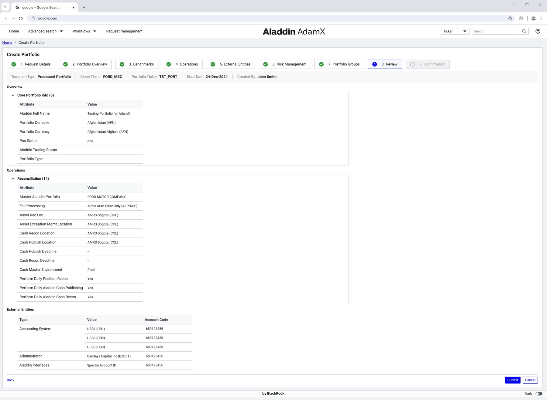
AdamX is BlackRock's internal workflow and rules platform inside Aladdin. This case covers Portfolio Services, where portfolios come to life, and how I took it from a legacy, operations-dependent process to a self-service workflow for internal teams and clients.

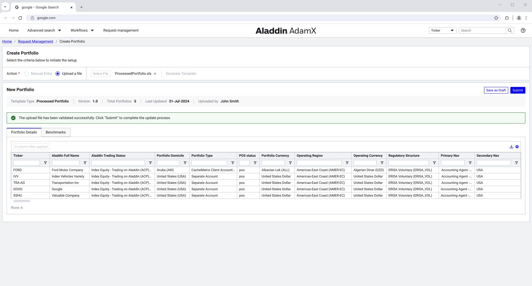
Create Portfolio. A validated bulk upload replaces one-by-one data entry.

Leadership

How I led

Team

3 developers, 1 product manager and several stakeholders, working as one squad.

Scope

One of 8+ design units at BlackRock, each with its own Lead Designer. I was the Lead Designer for Portfolio Services.

Addressing the challenge

Problem & solution

Problem

Every request depended on the operations team. Clients could not create or update portfolios on their own.

  • Onboarding split between Excel and a legacy UI
  • Hardened, inflexible navigation
  • Design system not aligned with Aladdin
  • No access for external users
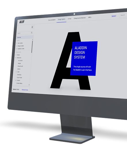
Aladdin Design System shown on a desktop screen

Solution

A request-based workflow on the Aladdin Design System, open to internal teams and external clients, from request to approval.

Guided creationBulk uploadBulk editRequest trackingRelationships
Results

What changed for the teams.

34%Less time per task creating and entering portfolio data, V2 compared with V3
40%Fewer steps in the portfolio onboarding flow
23%Fewer manual errors with bulk edit and the new information architecture

Measured in moderated prototype sessions with users.

Context

Fifteen years of one platform.

The service map. One solution for requesters, operations and approvers.

Design process

From audit to tested flow.

Step 1

Diagnostic

Goals and gaps of V1 and V2, the baseline for every measurement.

Step 3

Prioritization

Problems mapped against audience, KPIs and solutions.

Step 5

Prototype and test

Onboarding options compared on task time and completion.

Step 2

Stakeholder interviews

Operations teams, Aladdin clients, portfolio managers and business owners.

Step 4

AI research

AI capabilities benchmarked, plus AI-assisted synthesis and debriefs.

Design decisions

Four moves that removed the dependency.

Guided creation instead of a long form

An eight-step flow from request details to review. Every step shows what is done and what is left.

Bulk upload and bulk edit

Teams already worked in spreadsheets, so the platform met them there with templates and file validation.

Relationships you can see

A navigable hierarchy of clients, plans and portfolios, with 500+ attributes filtered to what matters.

One design language across Aladdin

V3 was rebuilt on the Aladdin Design System so AdamX feels like the rest of BlackRock's tools.

All projects Overview · Case 02

Fewer clicks between a clinician and the decision a patient is waiting for.

  • Client / Medecision · UM Vision
  • Role / Lead Designer · via Wizeline
  • Team / 3 designers
  • Length / 1 year, 8 months · 2022–2024

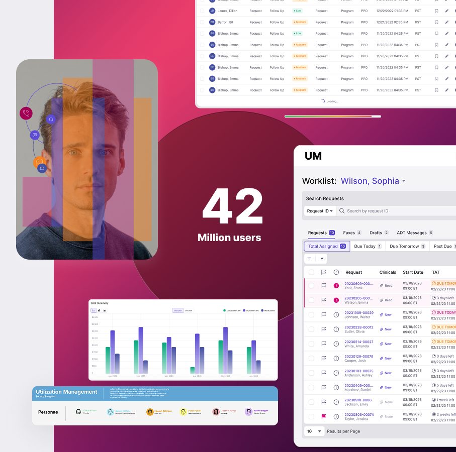
Medecision is a digital care management company whose solutions support more than 42 million people. Their clinicians review, approve and manage a large number of utilization requests every day, spread across platforms and teams. I led the design of UM Vision, the experience meant to connect all of it.

Addressing the challenge

Problem & solution

Problem

Reviewing a single request meant jumping between systems and typing the same information more than once.

  • Requests spread across 12+ platforms
  • Manual re-entry of patient and request data
  • Communication gaps between teams
  • A board expecting a clear direction for Q4
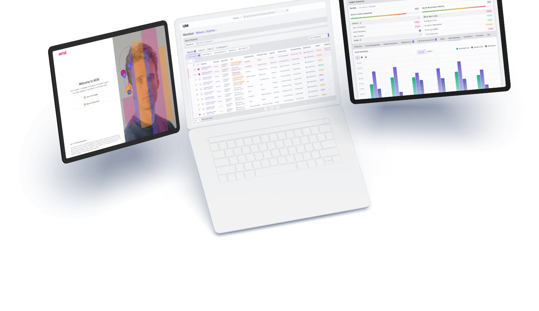
UM Vision worklist for clinicians

Solution

A prototype that automates the review flow and fills in known information, so clinicians stop re-typing and focus on the decision.

Auto-populated formsClinician worklistService blueprintCross-team flow
The work in numbers

What it took to get the whole system on one page.

27Research sessions with users and stakeholders
12+Platforms mapped into one experience
3Designers on the team I led
1Board of Directors presentation of the vision
Design process

From interviews to the boardroom.

Oct 2022

Research & discovery

Interviews to find which users and which manual tasks to target first.

2023

Ideation & prototype

Flows and a prototype that automate the process and fill in known data.

Workshops

Service blueprint

Built with the design team to map every actor, platform and handoff.

Mar 2024

Board presentation

Prototype and blueprint presented to Medecision's Board of Directors.

Listening first

Remote sessions with clinicians and stakeholders, synthesized into personas, process steps and pain points.

The service blueprint

Request initiation, prior authorization review and appeals, mapped across every role and system.

Design decisions

Stop re-typing, start deciding.

Forms that fill themselves

Known patient and request data flows into the next step, so nobody types the same thing twice.

One place to review

A clinician worklist and request detail view that bring the information from connected systems together.

Outcome

What happened after the boardroom.

Release V.02: when a request meets medical policy criteria, the assessment approves it automatically.

Mar 2024

The implementation release launched.

V.02

The assessment process was automated.

10 → 21

The project team grew to carry phase 2.

CMV app

UM Vision was integrated into the new version.

Design system

Now used across Medecision's applications.

All projects Overview · Case 03

A savings bank that lives in your pocket, built from zero for GM Financial.

  • Client / GM Financial · Seivy
  • Role / Lead Designer
  • Market / Colombia, then Mexico, Brazil and Chile
  • Length / 2019–2021 · 0 → 1 product

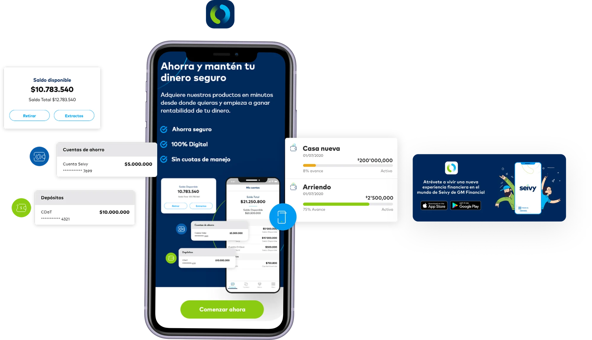
Seivy was GM Financial's first fully digital product: savings accounts, fixed-term deposits and savings goals, opened in minutes with no branch and no fees. It launched in Colombia with plans to expand across Latin America. I led the design experience end to end, from market research to the design system.

Leadership

How I led

Team

Led 3 designers in different countries, working alongside development, marketing and product.

Scope

Led the strategy and the digital product campaign, for both web and mobile.

Addressing the challenge

Problem & solution

Problem

A car-finance company launching its first digital savings product, with no existing channel, customers or playbook to lean on.

  • A digital product changes how marketing has to work
  • Customers' reasoning about saving was unknown
  • A new service spanning several third-party providers
  • Brand guidelines still had to reach the product
Seivy app splash screen

Solution

A 100% digital savings experience across website, app and online banking, where every step of the journey is simple enough to finish in minutes.

Digital onboardingSavings goalsCDaT simulatorOnline bankingDesign system
Results

What the launch proved.

COP 500MIn deposits raised during the first month after launch
5%Conversion through the digital onboarding flow
10–15New products planned on the design system baseline
Design process

Understand the saver before designing the bank.

Understanding

Market & customer

Market research, stakeholder interviews and a review of GM Financial's existing portals to define the target customer.

Ideation

Architecture & prototypes

Screens built from the process, decision trees and the information each step needs.

Definition

Personas & journeys

Needs, touchpoints, feelings, pains and gains, turned into opportunities per channel.

Test

Usability testing

Prototypes in front of potential customers to find what to fix before launch.

Three kinds of saver

Solution Seekers, Convenient Savers and Savvy Investors, each with its own financial complexity and digital habits. The research board is shown in its original Spanish.

Journeys, including the dealer

Before, during and after the decision, for two customer profiles and a car dealer partner.

Usability testing

Tested with each segment before launch.

6–10Participants across the three segments
4Scenarios to complete in each session
1h 05Per session, remote and face to face
74Average SUS score across segments
Solution Seekers70
Convenient Savers74
Savvy Investors79

System Usability Scale, 0–100. Scores above 68 are considered above average.

Design decisions

One structure for the website and the bank.

Information architecture: the public website on the left, online banking on the right, joined at log-in.

Wireframes first

Website, product pages and app flows defined in grayscale before the brand came in.

Savings goals, made visible

Pots for a new car or a house, with progress and monthly contributions always in view.

Brand on top

The brand guidelines applied to the approved wireframes across web, app and online banking. Screens are shown in Spanish, the language of the Colombian launch.

A system to grow on

Branding, guidelines, atoms, molecules, organisms and layouts, ready for the next products.

All projects Overview · Case 04

Two restaurant brands, one foundation to order from.

  • Client / Capriotti's + Wing Zone
  • Role / Senior UX Designer · via Monstarlab
  • Team / 2 designers
  • Length / 4 months · E-commerce

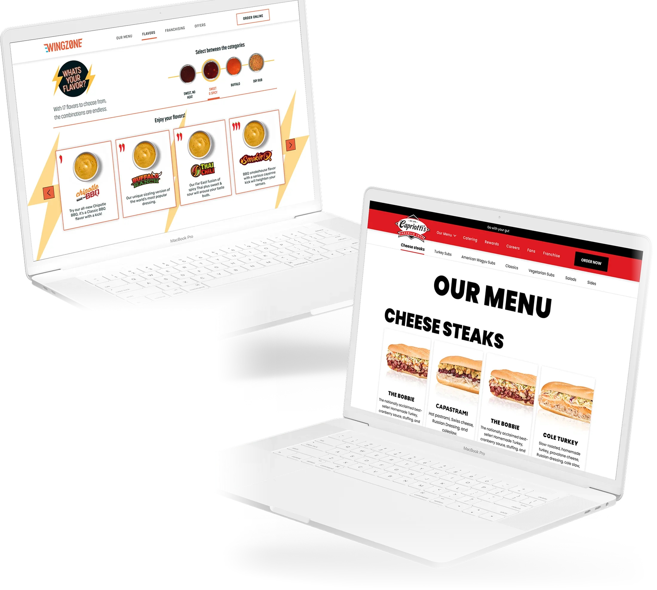
Capriotti's, founded in Wilmington, Delaware in 1976, is a sandwich franchise across the United States, and runs Wing Zone as a second brand. The brief: custom "front door" sites for both that give people value right away, while laying the foundation for a fully integrated ordering and loyalty experience.

Addressing the challenge

Problem & solution

Problem

Two brands with their own voice, one team and a short runway to put both online.

  • Each brand pulled in a different direction
  • Limited digital experience on the client side
  • Platform constraints from the ordering system in use
  • A tight timeline for the first version of the sites
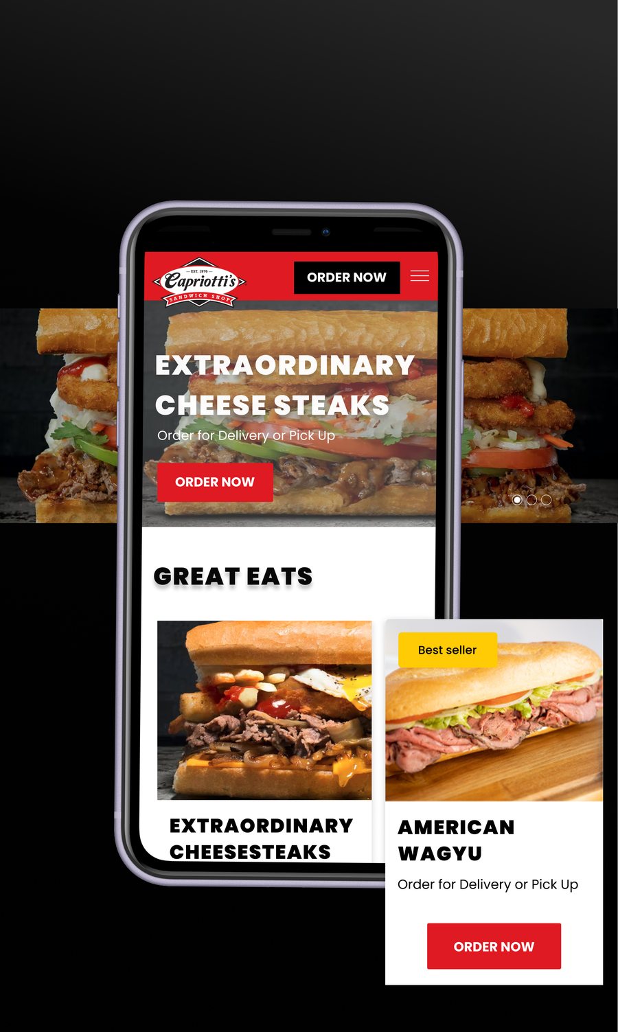
Capriotti's mobile home page with featured cheesesteaks and order buttons

Solution

A shared structure for ordering and loyalty, with each brand keeping its own look and tone on top, and a CMS so the team could build new pages on its own.

Front-door sitesShared architectureBrand valueOnline orderingCMS
Design process · 4 months

Learn both brands, then build one system.

1 · Discovery

Workshops

Learning about new offerings and brand concepts, then prioritizing tasks with the client.

3 · Ideation

Architecture & wireframes

Pairing both brand experiences on the sites with a clear e-commerce focus.

2 · Definition

Brand value & benchmark

What each brand stands for, and how a seamless experience carries it through the product.

4 · Implement

Concepts & build

Ordering integration and a CMS tool so pages could be built and customized.

A · Workshop & task prioritization
B · Brand value & benchmark
C · Information architecture & wireframes
D · Design concepts & mockups
Two brands

Same foundation, different personalities.

Capriotti's leads with its heritage and its sandwiches. Wing Zone is loud, fast and all about flavor.

Both sites share the same structure for menus, locations, offers and ordering, so customers get a familiar path and the team maintains one system. Typography, color and voice change on top.

Results

What the launch brought back.

SilverW3 Award, 2022, third place for Best User Experience and platform in the restaurant business
+5,000Returning customers across the United States through the loyalty program
2Brands running on a single channel foundation

For scale: the Capriotti's group brings in more than $200M in annual revenue.

All projects Overview · Case 05

One brand born from a merger, and a five-year plan to take it fully digital.

  • Client / AXA Colpatria
  • Role / Lead Designer
  • Domain / Insurance ecosystem
  • Length / 2014–2016 · roadmap through 2020

In 2014, AXA acquired 51% of Colpatria Seguros in Colombia, forming AXA Colpatria: a single competitor built out of two brands, serving 1M active customers through 130+ branch offices and 300+ agents and distributors. Every existing application had to migrate to the new brand in one consistent experience. I designed the five-year roadmap and the two connected platforms that carried it out.

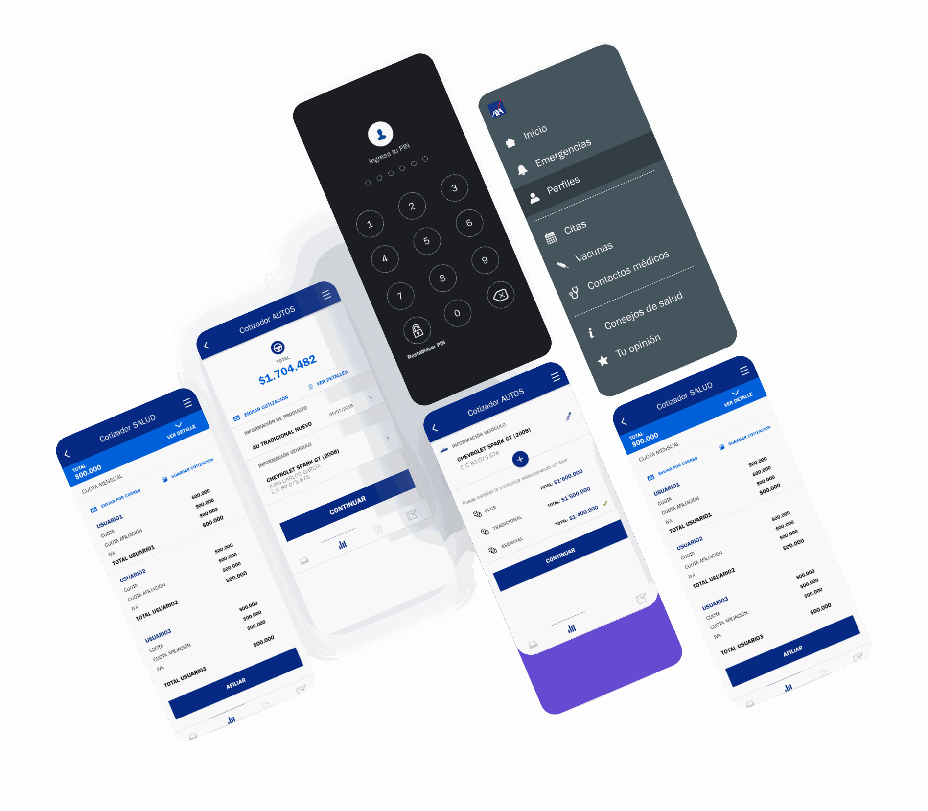
SOAT, health and auto quoters, alongside the customer app's menu and PIN access.

Leadership

How I led

Scope

Lead Designer across several business units: Autos, Life, General insurance and Capitalization.

Challenge

Unify the Colombian brand with the guidelines from AXA's parent company in Spain, so the experience felt consistent across countries.

Addressing the challenge

Problem & solution

Problem

Two brands, one migration, and almost everything still ran on paper.

  • No agent access on the main website, only manual verification
  • 70% of agents had to deliver documentation at the principal office
  • 90% of the onboarding process still ran on paper
  • Customers and agents worked on completely different apps
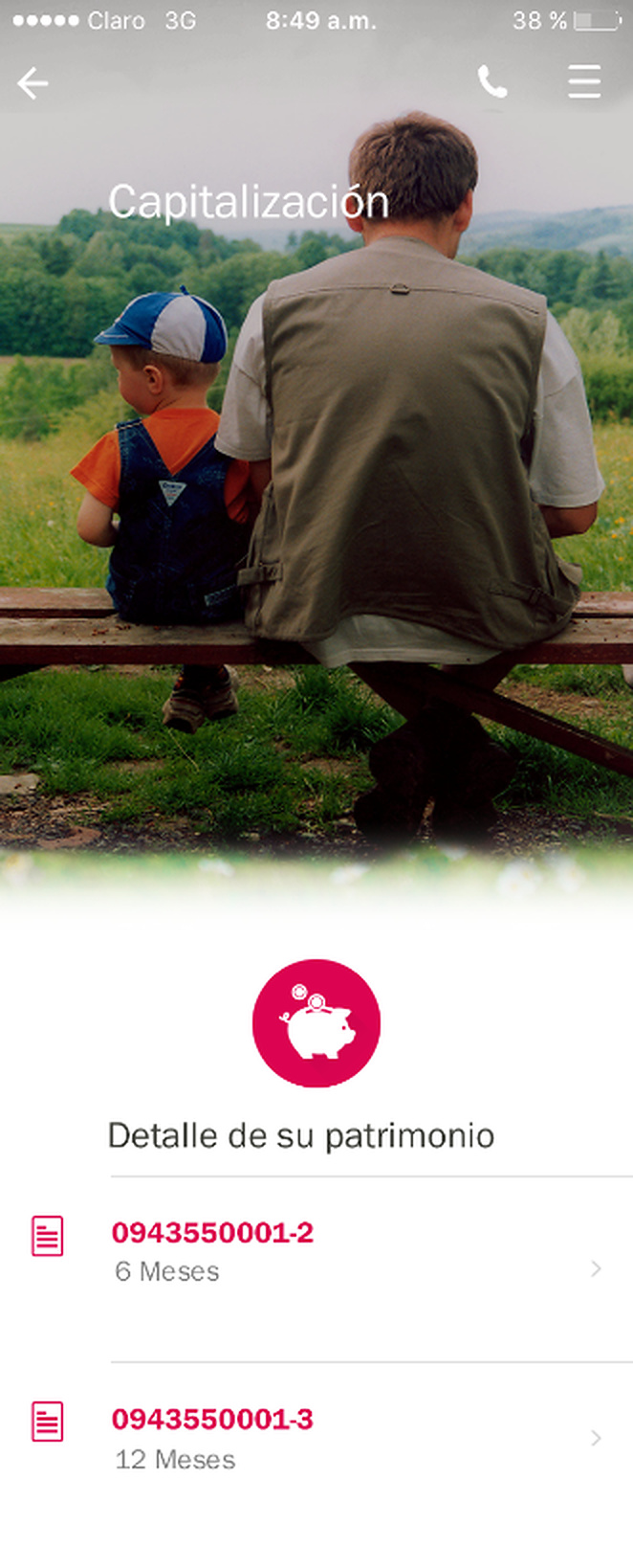
AXA Colpatria app screen for a Capitalización savings product

Solution

Two connected portals, DPW for distributors and CPW for customers, built on one brand, one design system and one toolkit.

DPW · Distributor portalCPW · Customer portalShared design systemAgent app
The work in numbers

Two platforms, mapped screen by screen.

140Screens designed for CPW, the customer online application
129Screens designed for DPW, the agent and distributor application
3Archetypes mapped from research: customer, agent and employee
5Phases, from discovery to evolution, repeated release after release
Design process

Discovery, on repeat, release after release.

1 · Discovery

Business exploration

The challenge, the brand and the information behind AXA Colpatria's two legacy systems.

3 · Ideation

Generate & socialize

Ideas tested against the business and brought back to the teams that had to build them.

5 · Evolution

Track & learn

Learnings carried from one release into the roadmap for the next.

2 · Interpretation

Opportunities & needs

Business opportunities and user needs turned into meaningful experiences to design for.

4 · Experimentation

Prototype & feedback

Prototypes in front of agents and customers before anything shipped.

Two portals, two very different days

DPW serves 350 agents and sales assistants still doing paperwork by hand. CPW serves customers stuck in a slow, restrictive onboarding.

Three audiences, one brand

Angela wants her documents always ready. Gabrielle wants the full catalogue at hand. Juan wants real-time records and 24/7 support. The persona board is shown in its original Spanish.

Design decisions

One sitemap, three connected flows.

Information architecture shared by both portals: products, quoters, client management and incentive reporting.

Customer onboarding, one of three flows mapped end to end alongside agent support and back-office service.

Toolkit and final screens

A system built to outlast the launch.

Every screen started as a wireframe before AXA Colpatria's visual language was applied on top.

AXA plus Colpatria, merged into one palette
A button and icon kit for every state
The system applied to real policies and renewals. Interface text is in Spanish, the language of the Colombian market.
DPW's client detail view, built on the new system
All projects Overview · Case 06 · Concept project

Knowing someone you love is safe, without watching their every move.

  • Client / Paso Enterprises · Paso Familia
  • Role / Product Designer · UX Research
  • Type / Mobile app, Android & iOS
  • Status / Concept, through a tested prototype

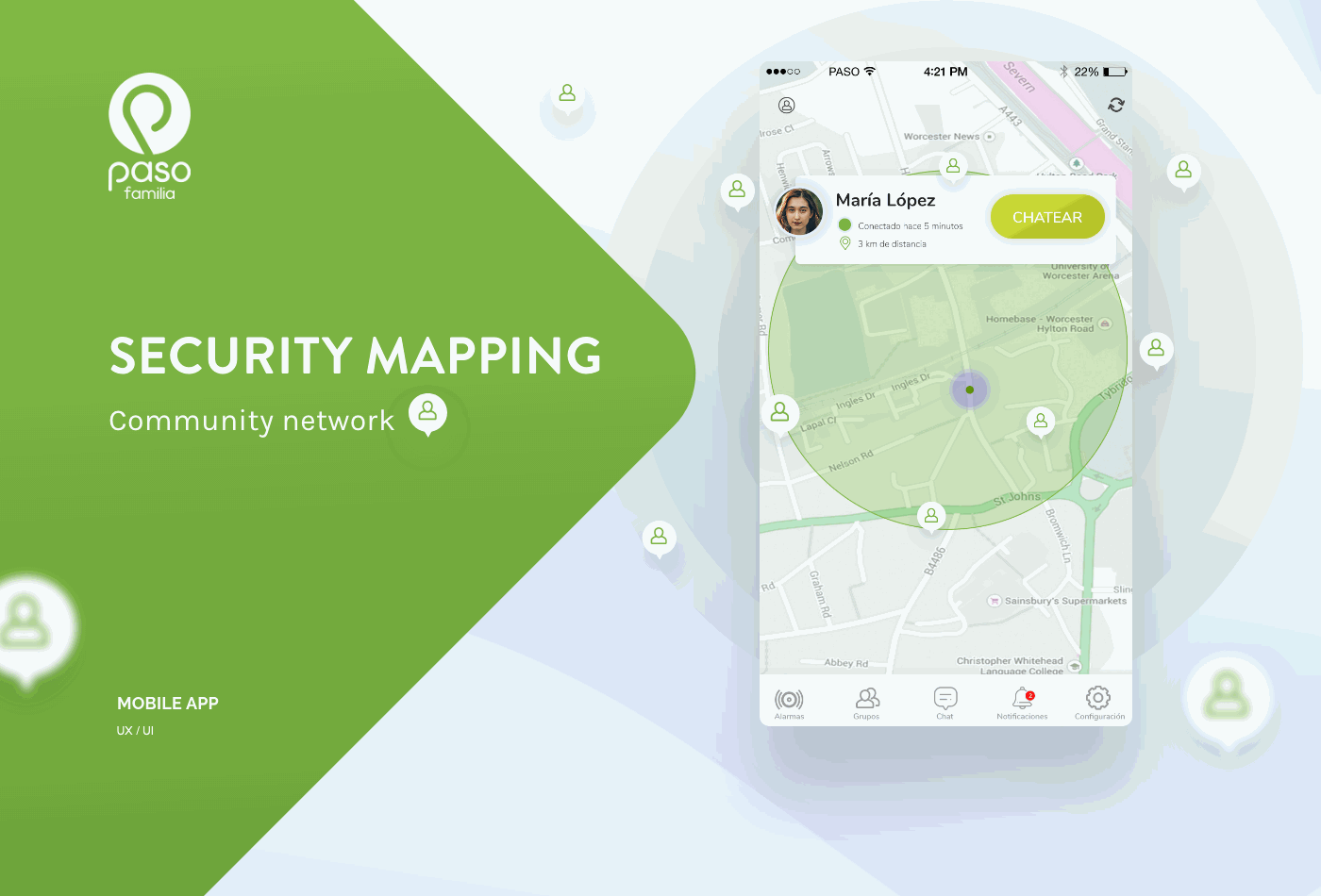
Paso is a security network with three services under one umbrella: Paso Edificios for buildings, Paso Empresas for companies, and Paso Familia, the one covered here, for families and friends. It trades a single location pin for shared, consent-based security zones, so the people who love you know you're safe without watching you all day.

Addressing the challenge

Problem & solution

Problem

During work hours and shifts, it's easy to lose track of the people you care about, and most location apps ask you to trade away your privacy to fix that.

  • No shared way to confirm everyone is safe
  • Constant tracking feels invasive to the people being watched
  • Busy people forget to check the app at all
  • Setup that depends on a slow validation code
Paso's three sub-brands: Edificios, Familia and Empresas

Solution

Zone-based, consent-first tracking: people share a radius, not a dot, with alerts over a low-friction, beacon-assisted connection instead of constant GPS.

Circle of trustSecurity zonesConsent-basedGroup alarms

The circle of trust, explained: a shared radius over the region, not a pin on a map.

Design process

Six steps, from benchmark to the development handoff.

The customer journey, built in a workshop with Paso's own users: six stages, from registration to tracking. Shown in its original Spanish.

Research

What +12 people actually asked for.

Direct quotes from interviews, in the users' original Spanish.

One flow, two ways in

Set up a zone and alarms, or jump straight to locating someone and sending an instant message.

One code, nothing else

A phone number and an SMS code are the only setup Paso Familia asks for.

Outcome

A tested flow, ready for a development team.

The circle of trust, live: zones, people and an open chat with whoever is inside them. The app interface is in Spanish.

+12 interviews

Shaped the onboarding and the notification design.

6 stages

Mapped in the customer journey, registration to tracking.

Zone-based

Shares a radius, not a live dot, by default.

Components library

Built so Paso Edificios and Paso Empresas could reuse it.

PWA

Scoped to run with no extra install, just a browser.